INTRODUCTION
Establishing your nonprofit brand can be intimidating, but let’s start with some basics! This article discusses 3 vital design aspects to consider when designing your nonprofit brand. You will learn about important design fundamentals: logos, colours, and typography. Having a preliminary understanding of brand design, will help you and your designer use your brand assets and establish a distinct and cohesive nonprofit brand. Legitimizing the look and feel of your brand will inevitably bring recognition and success.
LOGOS
First off, what is a logo? A logo is made of text, shapes, and colours that indicates the purpose of your organization. Your logo is a key part of your brand because it is going to appear on all things that pertain to your organization’s charity work. Your logo is also a symbol that volunteers and donors will remember and use to differentiate you from other nonprofits.
It is common to want everything but the kitchen sink in your logo design, but that is not realistic and frankly, it’s bad design. You want your logo to be: simplistic, memorable, scalable, readable, and distinct.
Take a look at a few of these nonprofit logos. They are displayed in black and white to show the impact and recognizability of a good logo design, even with no colour. In the next section, we will discuss colour.
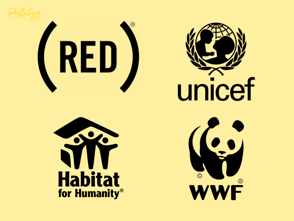
If you want to see more examples of logos, check out this article that shows 75 Top Nonprofit Logos.
Your logo will appear in many places such as: websites, impact reports, banners, fundraising material, documents, presentations, merchandise, and more. It’s important that you keep the appropriate logo file formats for use in digital and print media.
Before you read the next part, if you are not already familiar with Raster(pixel) vs. Vector files, check out this quick read article that explains the difference between the two.
Here are 4 common logo file formats to know:
PNG – Portable Network Graphic
File extension: LOGO.png
- Raster file – Pixel based format
- Can be compressed and decompressed without losing quality
- Supports transparency
- Easy to read and access, can be opened on computer, mobile, and tablets
- Use on: website, blog, as favicon(icon that shows up in browser tab), presentations, letterhead on documents, social media profile, as an image (e.g. watermark on document)
SVG – Scalable Vector Graphic
File extension: LOGO.svg
- Vector file format
- Can be scaled as big or small as needed, without losing any quality
- Supports transparency
- Small file size compared to PNG and JPG
- Editable on design software like Adobe Illustrator
- Web-friendly XML language
- Use on: print media, shirts, merchandise, stickers, labels, etc
- Should be used when sending your logo to a designer to make changes
EPS – Encapsulated PostScript
File extension: LOGO.eps
- Vector file format
- Can be scaled as big or small as needed, without losing any quality
- Editable on design software like Adobe Illustrator and photoshop
- Tricky to open in softwares other than Adobe Illustrator or Photoshop
- Supports transparency
- Use on: print media, shirts, merchandise, stickers, labels, etc
- Can be used when sending your logo to a designer to make changes, but make sure to check with your designer or printer first
PDF – Portable Document Format
File extension: LOGO.pdf
- Can be vector or pixel-based, it depends on how the PDF was created originally
- Easy to read and share
- Supports transparency
- Format is consistent on every device
- Use on: print media, shirts, merchandise, stickers, labels, etc
- Only editable on Adobe Illustrator or Photoshop
It can be intimidating to grasp file formats, so here is a resource that goes more in depth into the 4 common logo file formats.
COLOURS
Colours are important to establish to maintain a cohesive look and feel for your nonprofit brand. It is important to keep in mind that a good brand has no more than 4 colours. When choosing your colours, you will want a light colour for backgrounds, dark colour for text, a neutral colour, and a contrasting colour. You don’t have to choose 4 colours, but you shouldn’t have more than that.
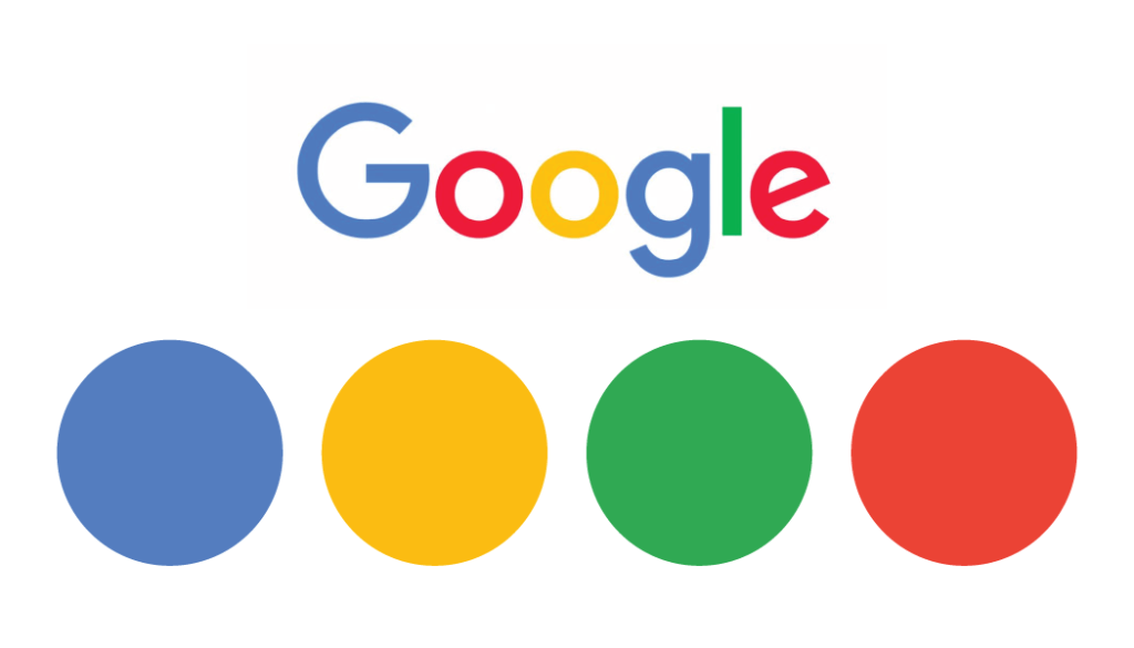
This is Google’s colour palette, it follows these rules.
There is meaning associated with colours. If you are not sure where to begin when choosing your colours you can think about what certain colours mean.
Green – Light shades represent growth, freshness, eco-friendly. Dark shades represent wealth, money, and cash.
Yellow – Happiness, positivity, and welcoming attitude.
Blue – Light shades represent stability, openness, flow. Dark shades represent trust, security, and comfort.Red – Passion, excitement, and energy.
Purple – Creativity, spirituality, luxury.
White – Peace, purity, calming nature.
Black – Bold, serious, authoritative, elegant.
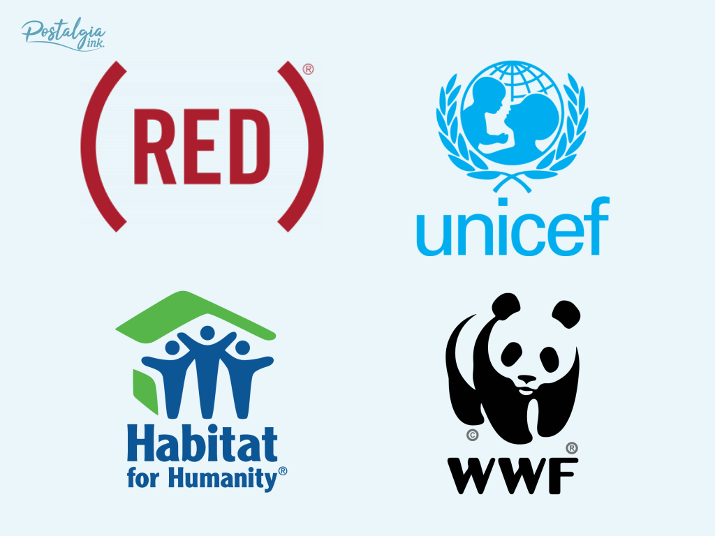
Circling back to the logos shown in the last section, take a look at how colour enhances logos.
After you have chosen your colours, you must keep a record of the specific HEX code, RGB values, CMYK values and Pantone® (PMS). This can be an intimidating concept, but your graphic designer will know what these are. Each colour format is used for different purposes.
Pantone® (PMS) and CMYK are for printing purposes.
HEX and RGB are for digital purposes.
This is how each colour format is listed for the specific blue Google uses.
HEX code: #4285F4
RGB Values: (66, 133, 244)
CMYK Values: (71, 47, 0, 0)
Pantone®: 279 C
Here is a link that shows the rest of Google’s color palette.
TYPOGRAPHY
Font selection is another beast when it comes to establishing your nonprofit brand. There are an endless number of fonts out there.
To make it simple, here are a few tips you can use to make the process easier:
- Choose a font that is different from your logo
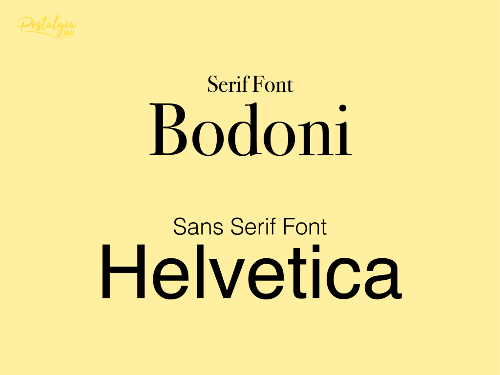
- Only use a serif or sans serif font (Serif: Bodoni, Sans Serif: Helvetica)
- Make sure it is readable and legible
- Get a designer to help guide you through font choices
There are a few options for how you can obtain the rights to use a font. You can either buy a font or find a free font. It is crucial if you are downloading a free font that it is free for commercial use. There are a lot of instances where you can download a font for free but it is NOT for commercial use.
List of places to buy fonts:
List of free font downloads:
https://www.1001freefonts.com/
NOTE: Google Fonts is the best when it comes to free fonts. They are all open source, high quality, easy to download, and can be embedded directly into your website.
CONCLUSION
This article covered 3 basic design fundamentals: logos, colour, and typography. It touched on what a logo is and the various aspects you should consider when figuring out its design. There was also information on logo file formats and when to use them. The colours section talked about how colour enhances a nonprofit brand design and how to specify your brand colours for digital and print use. Finally, this article ended on typography, what you need to consider when choosing your fonts and where you can find them.